
Branding and Visual Identity for YSecurity
Brand Identity · Art Direction · Campaign System · 2026
Brand Identity · Art Direction · Campaign System · 2026
In this project, we were approached by a startup called “Green Wave” to develop a brand identity that reflected their commitment to sustainability and environmental conservation. The client’s goal was to create a brand identity that would resonate with environmentally conscious consumers and help position their business as a leader in sustainable practices.
In this project, we were approached by a startup called “Green Wave” to develop a brand identity that reflected their commitment to sustainability and environmental conservation. The client’s goal was to create a brand identity that would resonate with environmentally conscious consumers and help position their business as a leader in sustainable practices.


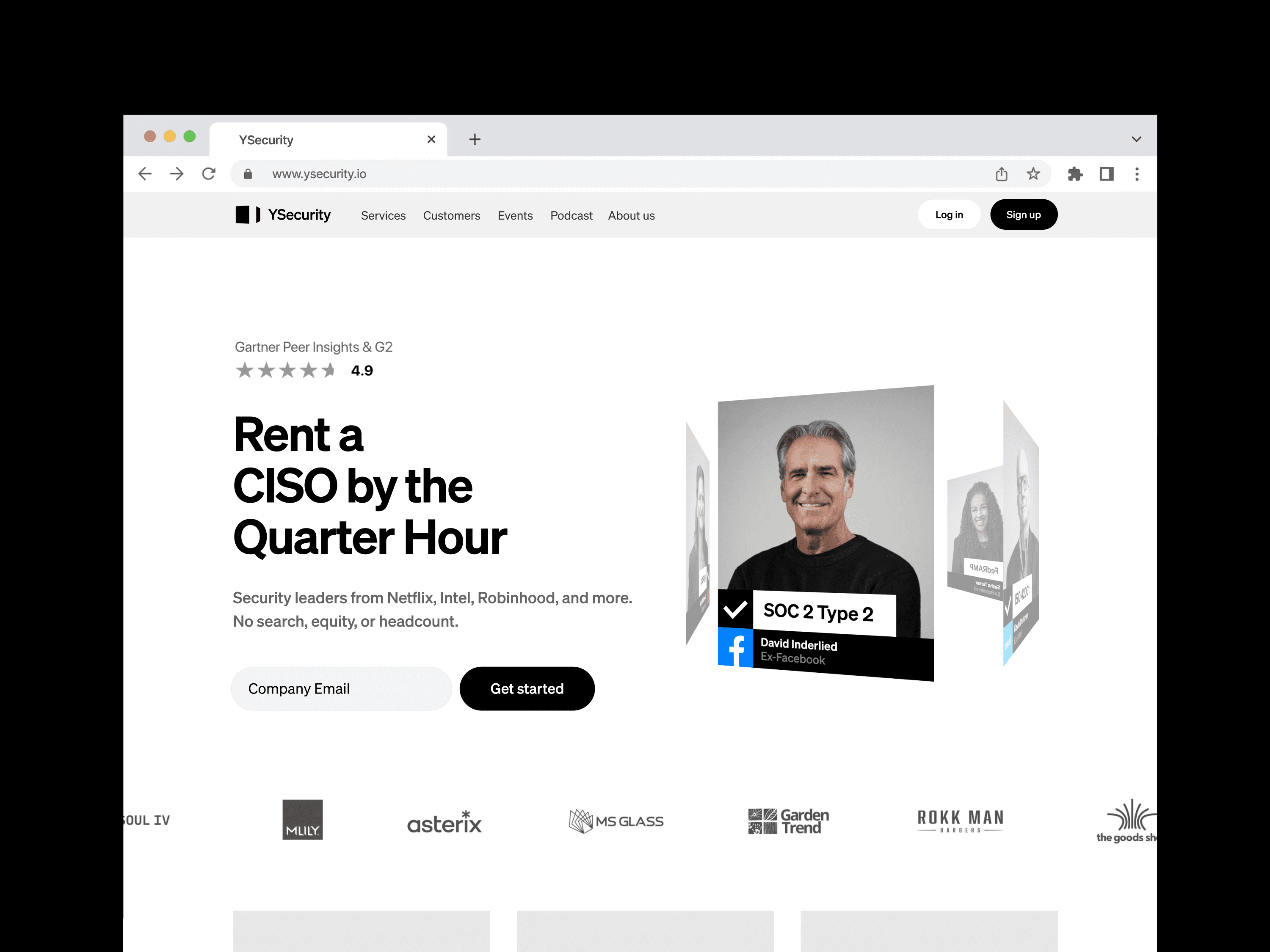


In this project, we were approached by a startup called "Green Wave" to develop a brand identity that reflected their commitment to sustainability and environmental conservation.
The client's goal was to create a brand identity that would resonate with environmentally conscious consumers and help position their business as a leader in sustainable practices. Objectives included increasing brand awareness and driving customer engagement.
Our approach was to create a brand identity that communicated Green Wave's values of sustainability, innovation, and authenticity. We developed a brand strategy that focused on creating a unique and memorable visual identity that would differentiate the brand from its competitors.
Our approach was to create a brand identity that communicated Green Wave’s values of sustainability, innovation, and authenticity. We developed a brand strategy that focused on creating a unique and memorable visual identity that would differentiate the brand from its competitors.
Brand identity
Art direction
Campaign system
2026
Brand Identity
2024–2026
YSecurity
4.6x organic traffic. 5.9x engagement time. 2.5x revenue. +70% podcast downloads. Built from zero as the company's first non-engineering hire — brand identity, design system, website, content, and the entire marketing function.

illy is a 100-year-old Italian coffee brand with a very settled visual language: red square, white script, warm Italian light. The brief was to say something new about the taste without saying anything new about the logo.


illy Experiences imagines the coffee as an altered state. Each roast is rendered as a sculptural form that shouldn’t exist—a bloom of gold and white for the light roast, a spiral of iridescent dark for the espresso—set against black and placed into the streets of old European cities. Futuristic objects on historic stone contrast in the image which in of itself has tension in the cup. Two lines carry the campaign—Join the Dark Side for the dark roast, Taste Something Higher for the light. Executions run from full building wraps to street posters and bus shelters. The red square never moves, but everything around it does.
Art Direction
Advertising Campaign
Out-of-Home
2021