
Morae — Tea Packaging Design
Brand Identity · Packaging · Art Direction · 2020
Brand Identity · Packaging · Art Direction · 2020


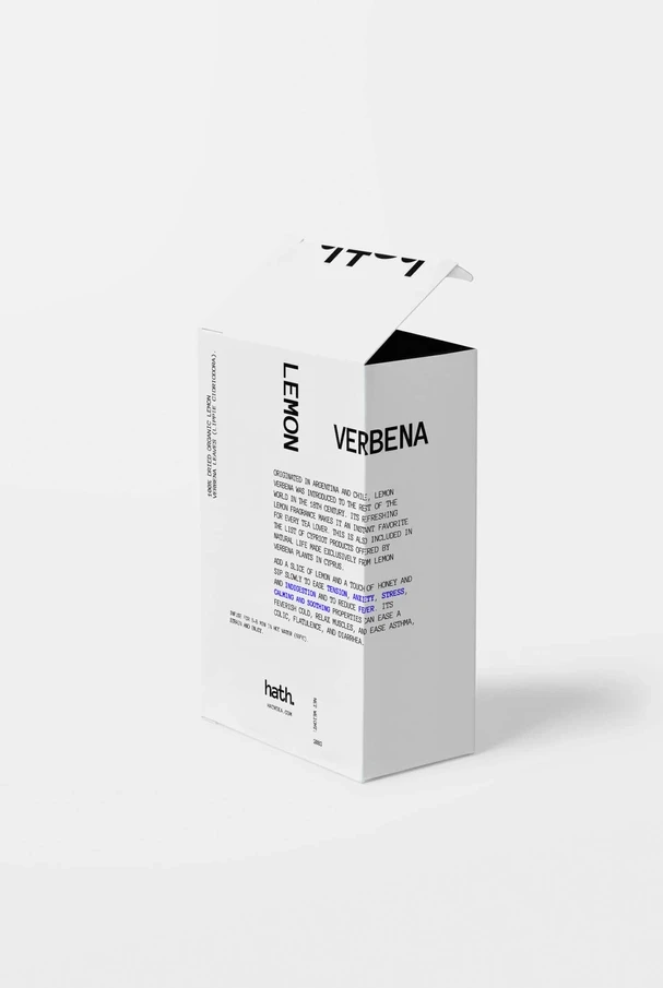
Hath is a Cypriot herbal tea—four single-source herbs, lemon verbena, sage, anise, and elder, each grown and picked on the island. The category shelf is a wall of color and botanical illustration. The job was to make a small brand impossible to miss on it.
Hath is a Cypriot herbal tea—four single-source herbs, lemon verbena, sage, anise, and elder, each grown and picked on the island. The category shelf is a wall of color and botanical illustration. The job was to make a small brand impossible to miss on it.



Hath is a Cypriot herbal tea—four single-source herbs, lemon verbena, sage, anise, and elder, each grown and picked on the island. The category shelf is a wall of color and botanical illustration. The job was to make a small brand impossible to miss on it.
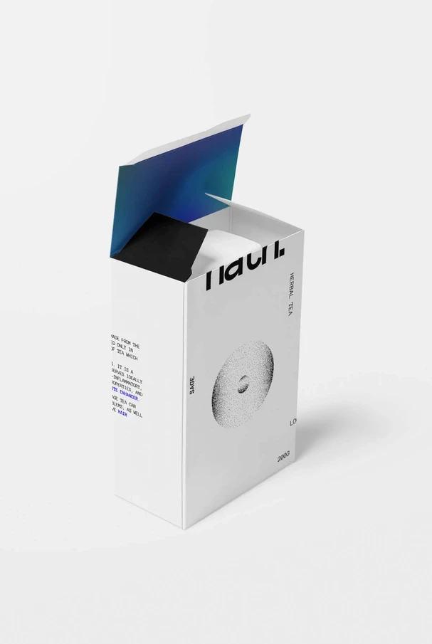
The answer was to remove color entirely. Hath's boxes are white with a single stippled black form—a different one for each herb—and nothing else on the front but the name and the variety. Each stipple pattern is built from dots that scatter and gather the way the herb does, from soil to cup: a dense ring for elder, a loose bloom for lemon verbena. The white space is intended to evoke the same lightness the tea has. The package breathes.
Against a full-color shelf, four white boxes read as a pause. The concept moved from a college brief into small-batch production and is sold in shops in Nicosia and Limassol.
The answer was to remove color entirely. Hath’s boxes are white with a single stippled black form—a different one for each herb—and nothing else on the front but the name and the variety. Each stipple pattern is built from dots that scatter and gather the way the herb does, from soil to cup: a dense ring for elder, a loose bloom for lemon verbena. The white space is intended to evoke the same lightness the tea has. The package breathes. Against a full-color shelf, four white boxes read as a pause. The concept moved from a college brief into small-batch production and is sold in shops in Nicosia and Limassol.
Brand Identity
Packaging
Art Direction
2020
Package, Visual Identity
2020
Hath Herbal Tea
4.6x organic traffic. 5.9x engagement time. 2.5x revenue. +70% podcast downloads. Built from zero as the company's first non-engineering hire — brand identity, design system, website, content, and the entire marketing function.

illy is a 100-year-old Italian coffee brand with a very settled visual language: red square, white script, warm Italian light. The brief was to say something new about the taste without saying anything new about the logo.


illy Experiences imagines the coffee as an altered state. Each roast is rendered as a sculptural form that shouldn’t exist—a bloom of gold and white for the light roast, a spiral of iridescent dark for the espresso—set against black and placed into the streets of old European cities. Futuristic objects on historic stone contrast in the image which in of itself has tension in the cup. Two lines carry the campaign—Join the Dark Side for the dark roast, Taste Something Higher for the light. Executions run from full building wraps to street posters and bus shelters. The red square never moves, but everything around it does.
Art Direction
Advertising Campaign
Out-of-Home
2021