
Brand Identity · Motion Design · Out-of-Home
Visual Identity for
Cyprus Design Week 2026 Festival
Cyprus Design Week is a multidisciplinary festival bringing together graphic design, motion, digital media, architecture, fashion, product design and other creative practices. I developed a visual identity that transforms the familiar instruction to “think outside the box” into something more physical,



Project Type
Concept Identity
Role
Creative Direction, Concept, Visual Identity, Art Direction, Typography and Motion Design
Event
December 16–22, 2026
Problem
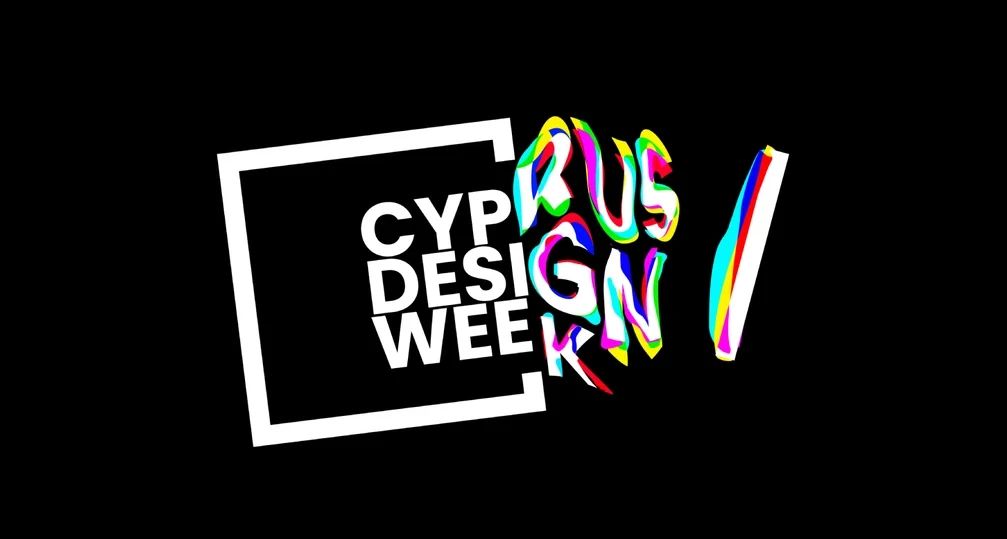
The identity transforms the familiar idea of “thinking outside the box” into an act of liberation. A rigid black frame represents convention and self-imposed limitations, while typography, imagery and color push through its opening. As each element escapes, it becomes increasingly expressive. The system captures the moment of leaving familiar structures behind and encountering the full spectrum of creative possibilities beyond them. contemporary visual language—presenting Cypriot culture not as something static, but as creative material that can be reinterpreted and carried forward.
Solution
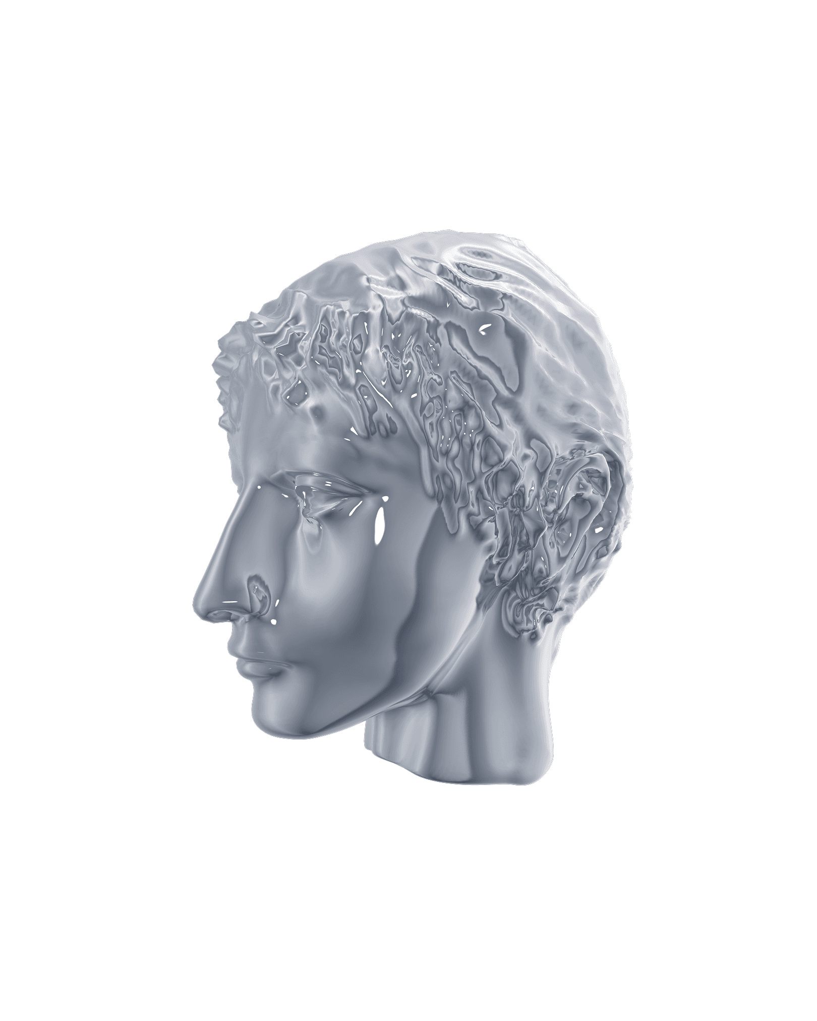
A Cypriot limestone head of a male votary, dating to approximately 500–450 BCE, connects the festival to the island’s cultural history. Fragmented, distorted and transformed through vivid digital color, the ancient sculpture enters a contemporary visual language—presenting Cypriot culture not as something static, but as creative material that can be reinterpreted and carried forward. contemporary visual language—presenting Cypriot culture not as something static, but as creative material that can be reinterpreted and carried forward.
Outcomes
Motion completes the idea. Sculpture, typography and color break through rigid structures across posters, animated teasers, digital banners and outdoor media—turning each application into another act of liberation.
The idea starts with the tiredest phrase in the field, think outside the box, taken literally. The wordmark sits inside a square frame and the letters refuse to stay in it—they’re designed to break the edge, and where they break, they split into full-spectrum color. Every discipline is a wavelength; the week is the whole spectrum. The break also gave the system its motion logic: in the animated identity, type escapes the frame, and the color separation becomes the transition between screens. The system scaled from a single mark to billboards, welcome screens, and event motion graphics—the same square and break on everything.
Brand Identity
Motion Design
Out-of-Home
2026

illy is a 100-year-old Italian coffee brand with a very settled visual language: red square, white script, warm Italian light. The brief was to say something new about the taste without saying anything new about the logo.



illy Experiences imagines the coffee as an altered state. Each roast is rendered as a sculptural form that shouldn’t exist—a bloom of gold and white for the light roast, a spiral of iridescent dark for the espresso—set against black and placed into the streets of old European cities. Futuristic objects on historic stone contrast in the image which in of itself has tension in the cup. Two lines carry the campaign—Join the Dark Side for the dark roast, Taste Something Higher for the light. Executions run from full building wraps to street posters and bus shelters. The red square never moves, but everything around it does.
Art Direction
Advertising Campaign
Out-of-Home
2021
Brand Identity · Motion Design · Out-of-Home